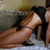
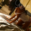
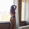
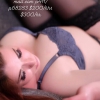
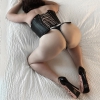
Beautiful two pics there (light years ahead of your last set) and nice start on the site
But a couple constructive notes:
1. Your showcases's link is broken. Instead use:
http://verykeri2114.webs.com/ (or drop the "S" from httpS)
2. Your text color scheme is hard to read (dark black text highlighted with dark purple with a white background). Keep it simple with just two contrasting tones (dark on light or vice versa, not dark on dark).
3. Your site tabs are labeled: "About Us" & "Contact Us." Are there two of you?
P.S. Is that a UFO in the top left of your second pic? o_O?


 My Bio Page - Louisiana - New Orleans

 My Bio Page - Kansas City Metro
 My Bio Page - Louisiana - New Orleans